

The Quiet Psychology Behind Premium Design Experience
Premium brands understand that saying less while meaning more creates the perception of exclusivity and strategic depth that your target market values.
Brand Blinks Global
3 min read
Design isn’t about what’s added. It’s about what’s intentionally left out. Digital service brands that feel premium don’t scream; they simply refuse to clutter.
This philosophy perfectly captures the essence of premium brand positioning and should become the foundational principle driving your entire website transformation.
Premium brands understand that saying less while meaning more creates the perception of exclusivity and strategic depth that your target market values.
1. Fewer menu items (max 4–5)
Signals clarity, confidence, and zero clutter. Complexity is for the back-end, not the user.
2. Extra white space between blocks
Breathable layouts reduce stress and elevate focus; it feels like working with someone calm and composed.
3. Micro-interactions that feel human
Buttons that gently pulse or tilt on hover feel alive, making digital experiences feel more tactile.
4. Cursor trails or smart cursors
A cursor that subtly transforms near interactive elements shows design intent and sharpens UX elegance.
5. Limited, consistent color palette
Monotone or two-tone systems ooze restraint, control, and a strong identity. Loudness is cheap.
6. Slow, confident animations
Fast transitions feel rushed. Slower animations feel deliberate and luxurious, like high-end watches ticking.
7. Fewer calls to action
One confident CTA per screen/page shows you know what the user needs to do. No confusion. No competition.
8. Serif body fonts or high-contrast modern typefaces
Serif type gives authority. Modern contrast fonts give elegance. Both whisper, "We know design."
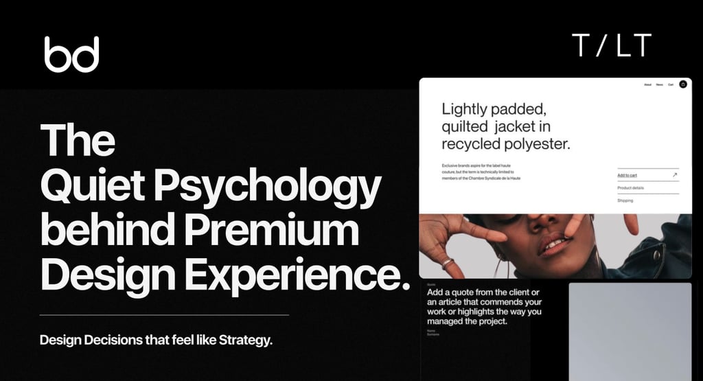
9. Hero sections with zero clutter (just one line & logo)
Feels like standing in a quiet lobby of a billion-dollar firm. Understated confidence.
10. Transparent pricing with no surprise asterisks
Transparency is a luxury. Clarity beats complexity, always.
11. Subtle motion on page scroll
Parallax and light fade-ins offer continuity and polish. It feels handcrafted, not generic.
12. Edge-to-edge sections with full-width images or content
Immersive. Gives each section the feeling of a “chapter,” not just more content.
13. Predictive form fields with auto-suggestions
Helps before being asked, quietly tells users, “We get you.”
14. Interactive onboarding sliders instead of a dropdown hell
Feels more like a conversation than a task. Feels human.
15. Acoustic feedback or haptic-like vibrations on mobile
When even a button click feels “premium,” you’ve crossed into emotional UX territory.
16. Personalized dashboards with the user’s name and behavior-based shortcuts
Says “this is your space” without ever saying it. Familiarity = premium.
17. Clean URLs with meaningful slugs (not ?id=9342)
Small touch, but screams engineering and brand sophistication.
18. Case study pages are designed like editorial layouts
High-end layout mimics luxury magazine spreads. Makes your work feel like art, not just data.
19. Invisible loading bars
Replace spinner wheels with subtle progress indicators built into the layout or background. Less noise, more trust.
20. Intelligent error states and 404 pages with personality
No generic errors. A witty or beautifully designed “something went wrong” page shows you care in every corner.
If your brand identity isn’t pulling its weight, now is the time to act. Before you spend more on marketing, pause and ask: Is your brand even ready to be remembered?
Because in business, being forgettable is far more expensive than being bold.
Building It All - A Brand that Works for You
So, building a business is dating, with more hustle, fewer date nights, and a lot more coffee and sleepless nights. But when will it finally work? It’s the best thing ever.
BRNDx | Build, Launch, Scale a Brand. All Together.
BRNDx is an all-in-one fast-track solution that helps turn your business idea into a purpose-driven brand, built, launched, and scaled in no time.
If brand identity is the message, design is the mode of communication.
Defines the entire customer experience.
A cohesive visual design across all brand channels and assets is a key part of creating a positive customer experience, and it will ultimately improve customer acquisition rates and broaden your customer base.

© 2026 BRNDxMORPH Media WWD Private Limited. All rights reserved.
Brand Blinks Global® | BBG is an independent global brand consulting and transformation company.
The trademarks, logos, and service marks displayed on this site are the property of their respective owners.
"Brand Blinks Global® | BBG," "Brand Blinks®," "Made for the Uncommon®," and the "bd®" logo are trademarks or registered trademarks of BRNDXMORPH Media WWD Private Limited.
RESOURCES
INTELLIGENCE
BUSINESS
PARTNER
