
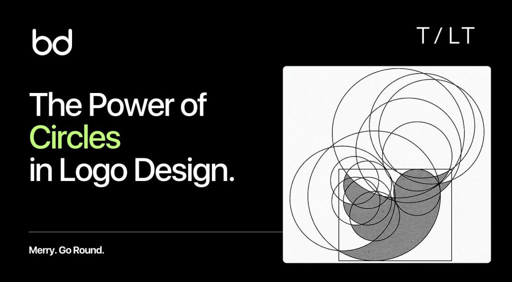
The Power of Circles in Logo Design
Circles anchor deep cultural meaning, cognitive science, and strategic branding psychology. For marketers and founders pushing beyond visuals into business strategy, understanding the “circle effect” transforms aesthetics into brand engineering.
Brand Blinks Global
4 min read

Why do the world’s most iconic brands, BMW Group , Starbucks, and the International Olympic Committee – IOC, lean so heavily on circles in their logos?
Circles anchor deep cultural meaning, cognitive science, and strategic branding psychology.
For marketers and founders pushing beyond visuals into business strategy, understanding the “circle effect” transforms aesthetics into brand engineering.
Why Circles Dominate Branding Psychology
Cognitive science confirms that shape registers in the brain faster than color or text. This makes shape an underutilized but high-impact branding lever.
Among all shapes, circles hold exceptional power: free of harsh edges and defined by smooth continuity, they evoke inclusivity, warmth, approachability, and perpetual motion. Psychologists often associate circles with community, stability, and balance, making them branding gold.
In branding, circles repeatedly symbolize:
Unity & Community: Olympic rings, Wikipedia globe. Their permanence signals belonging and collaboration.
Wholeness & Balance: Symmetry fosters calm and equilibrium, reinforcing a brand’s completeness.
Protection & Continuity: Rounded edges suggest safety, resilience, and durability qualities that businesses in wellness, tech, and finance actively seek to communicate.
Industry Impacts: From Automotive to Community-Driven Startups
The power of the circle cuts across industries:
Automotive & Technology: BMW Group and AT&T precision, connectivity, global networks. Sphere motifs reinforce innovation and movement. Car logos that encircle dynamic lines telegraph reliability while appealing to global aspirations.
Health, Wellness & Social Brands: NIVEA's iconic round blue tin echoes protection, care, and trust. Medical clinics and wellness initiatives adopt circles to visually portray wholeness and calming assuranceessential in health messaging.
Food, Beverage & Community Retail: Organic markets, and neighbourhood cafés often frame their brand in circles to evoke safety, inclusivity, and community trust. Circles act as an open invitation for people to gather, connect, and stay.
Theory-Heavy Perspectives: Cognitive Bias and Geometric Reasoning
Beyond aesthetics, the power of circles also lies in human perception.
Geometric reasoning studies report a fascinating bias: when asked to imagine relationships or systems, people overwhelmingly choose circles or intersecting circle configurations 60–90% of the time.
Why? Circles unconsciously prime the brain to perceive linkage, overlap, and openness.
In brand identity, this matters. Before your audience reads a tagline or product feature, the circle already signals trust, connection, and preference. The geometry itself boosts recall and favorability, a hidden but measurable advantage.
How Color Amplifies Meaning in Circular Logos
Not all circles send the same message. Color dramatically shifts perception, adding another psychological layer:
Blue Circles – Trust, reliability, professionalism. Seen in BMW, LinkedIn, and corporate brands, they instil long-term confidence.
Red Circles – Energy, urgency, vitality. Used in retail or entertainment, red circles stimulate faster action.
Green Circles – Growth, harmony, sustainability. Eco-conscious and wellness brands leverage green circles to underscore nature-driven values.
Black Circles – Elegance, sophistication, power. Minimalist luxury and tech brands adopt black circles for sleek visuals.
Designing for the Modern Market: Minimalism and Versatility
Logo design in 2025 favors minimalism. Clean geometric forms, especially circles, outperform ornate, complex marks across digital and physical applications.
Why? Circles adapt seamlessly whether as app icons, website headers, or billboards.
Minimal circle logos also integrate well with dynamic variations: overlapping rings, cut-outs, subtle gradients. These allow brands to evolve design depth while preserving the instant recognition factor.
A circle-based design ensures clarity in small screens and scalability across big displays, supporting today’s multi-channel branding needs.
Circle Variations: Ovals, Rings, Spirals & Their Messaging
While perfect circles remain dominant, variations expand messaging:
Perfect Circles → Unity, harmony, stability
Ovals → Flexibility, natural softness, adaptability
Rings/Linked Circles → Relationships, partnerships, permanence (wedding bands, Olympics)
Spirals → Growth, creativity, evolution favored for community, transformation, or innovation-driven enterprises
These subtle shifts give designers tools to carve brand-specific nuance while staying within the durable geometry of rounded design.
Industry Research: Who Uses Circles, and Why?
The dominance of circles is quantifiable, not anecdotal.
Over 30% of Fortune 500 companies utilize circles in their main logos.
Tech, health, and food sectors lead adoption due to the circle’s associations with trust, balance, and approachability.
Consumer psychology studies reveal that circular logos improve:
Warmth & Comfort: Consumers find rounded marks more “friendly” and report higher trust.
Memorability: Circular logos are easier to recall in crowded marketplaces.
Inclusivity: Educational and social enterprises use circular motifs to embody equity, belonging, and shared purpose.
We don’t view circles as mere shapes; we view them as strategic signals. Our process combines cognitive science, cultural insights, and design precision. Whether you’re relaunching your logo or scaling across industries, every curve must convey more than design; it must embody market power.
We integrate brand audits, content testing, and cognitive framing to ensure your visual ecosystem bridges aesthetics and psychology. Using UX audits and visual hierarchy checks, we confirm that your circle logo performs consistently across small-screen apps, responsive websites, and print campaigns.
Our design methodology ensures circles do not just look iconic but actually convert visibility into brand equity.
The Bottom Line: Should Circles Shape Your Brand?
Circles aren’t universal. Their psychological power fits better in industries prioritizing connection, community, health, trust, and innovation. Brands in luxury minimalism, ecological responsibility, and even tech reliability amplify their gravitas with rounded logos.
So here’s the question to you:
When you see a circular logo, does it feel more trustworthy to you than angular shapes?
Which circular logo first comes to your mind when you think “iconic”?
Brand Blinks Global | Where Theory Meets Meaningful Visuals

© 2026 BRNDxMORPH Media WWD Private Limited. All rights reserved.
Brand Blinks Global® | BBG is an independent global brand consulting and transformation company.
The trademarks, logos, and service marks displayed on this site are the property of their respective owners.
"Brand Blinks Global® | BBG," "Brand Blinks®," "Made for the Uncommon®," and the "bd®" logo are trademarks or registered trademarks of BRNDXMORPH Media WWD Private Limited.
RESOURCES
INTELLIGENCE
BUSINESS
PARTNER
