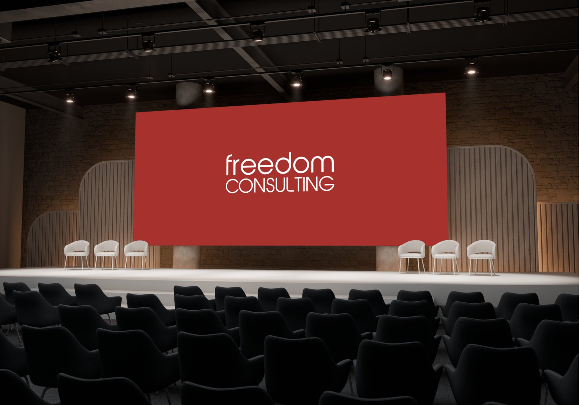
Reinvented FREEDOM Inc. without losing its Global Footprint Legacy.


Brand Insights.
Client: Freedom Consulting Inc. (formerly part of a Japanese conglomerate, FREEDOM Inc.)
Objective: Re-establish FREEDOM as a modern, independent global entity with a fresh identity, enhanced digital presence, and compelling market positioning.
Industry: Business Consulting & Services
Region: Global (brand focus emphasizing Tokyo, Singapore, Kuala Lumpur, Mumbai, Bangalore, Melbourne, Australia, and the USA)
Year: 2025
Challenge: After a corporate demerger, Freedom Consulting Inc. faced the challenge of distancing itself from its Japanese legacy while developing a new identity that resonates across international markets.
Core Focus.
Our Transformation Path (within 2 weeks)
Audit & Diagnostics
Strategy & Positioning
Design Systems
Fresh Identity Development
Web Design & Development
Content Strategy and Guidelines
Voice & Tone
Brand Launch Video Production
Marketing Collaterals
GTM Strategy
PR Strategy and Communications
Growth Systems
Our Psychological Functions.
Freedom Inc.'s 14-day evolution applied cognitive fluency and authority signaling to convert legacy consulting into global enterprise leadership, driving +35% demos and 22% faster sales cycles.
1. Cognitive Fluency:
Simplified messaging reduced mental friction for C-suite audiences, making "strategic evolution" instantly memorable vs. generic rebrands.
2. Authority Bias:
Strategic evolution preserved "FREEDOM" equity while signaling Category King status, triggering executive trust signals.
3. Impact:
Legacy-to-leader perception shift in 14 days.




About.
Freedom Consulting Inc. is a global technology and business consulting firm known for its innovation-first mindset and high-impact delivery. Operating across borders, the company specializes in driving mission-critical transformations that accelerate digital maturity for enterprises worldwide.
With deep-rooted expertise in SAP, Salesforce, and digital supply chain optimization, Freedom Consulting empowers organizations to bridge operational gaps and build resilient, future-ready ERP, CRM, and logistics ecosystems.
From Fortune 500 leaders to fast-scaling businesses, Freedom Consulting simplifies complexity, boosts process efficiency, and enables seamless digital transformation. Clients benefit from tailored, one-on-one support, ensuring every transformation journey is not only successful but also sustainable.
1. Problem Statement
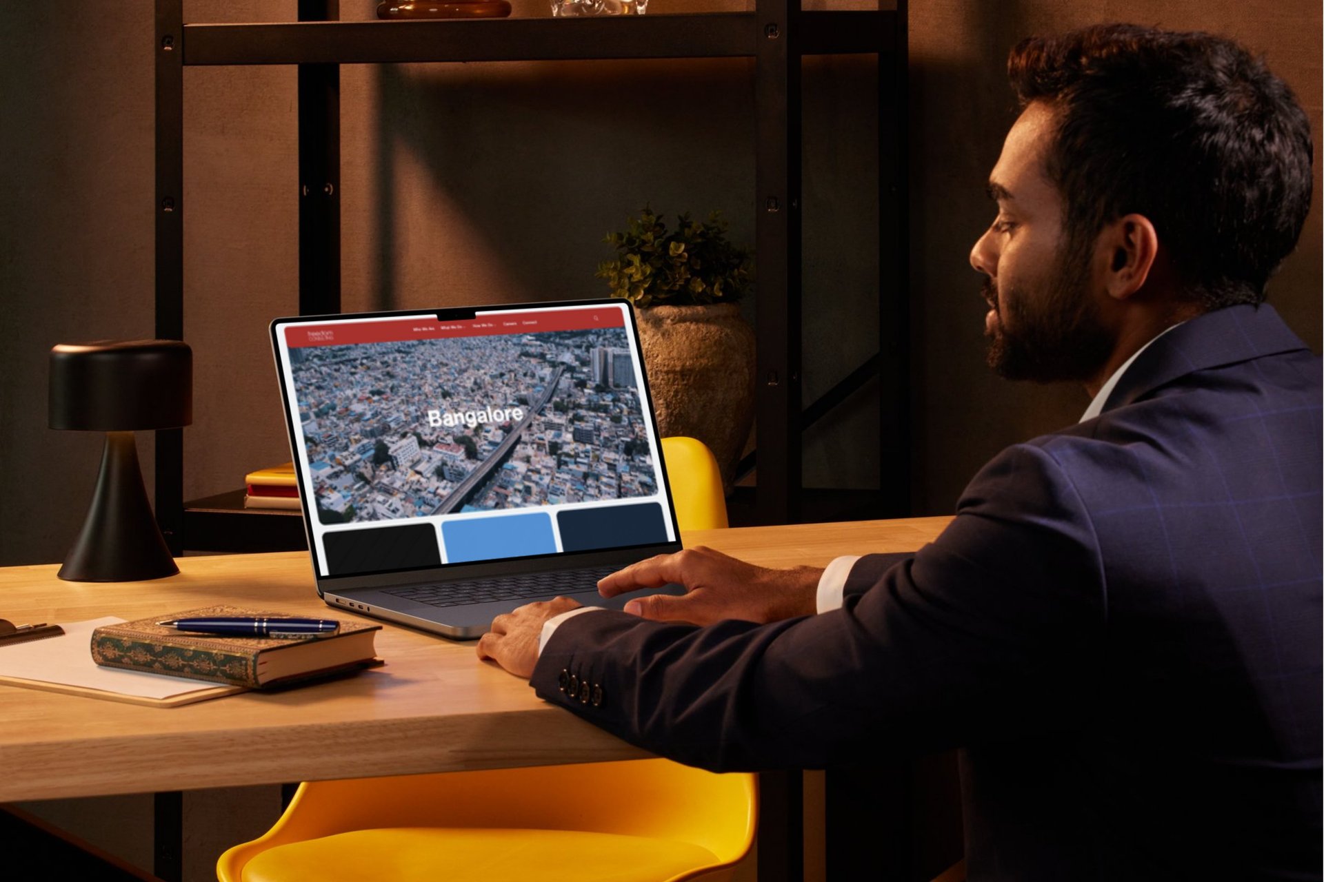
After a corporate demerger, Freedom Consulting Inc. faced the challenge of distancing itself from its Japanese legacy while developing a new identity that resonates across international markets. The lack of a standalone brand voice, outdated digital infrastructure, and inconsistent messaging diluted its credibility and global appeal within a deadline of 2 weeks.
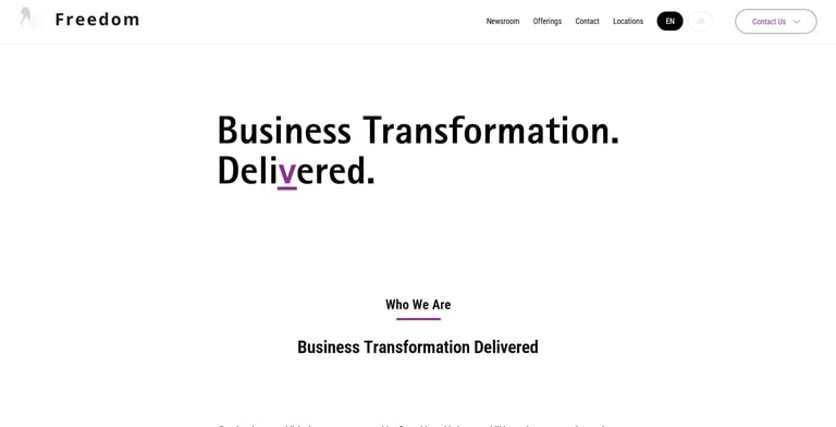
Old Web Experience.
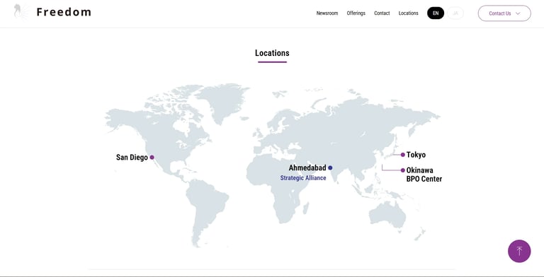
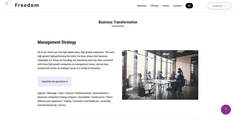
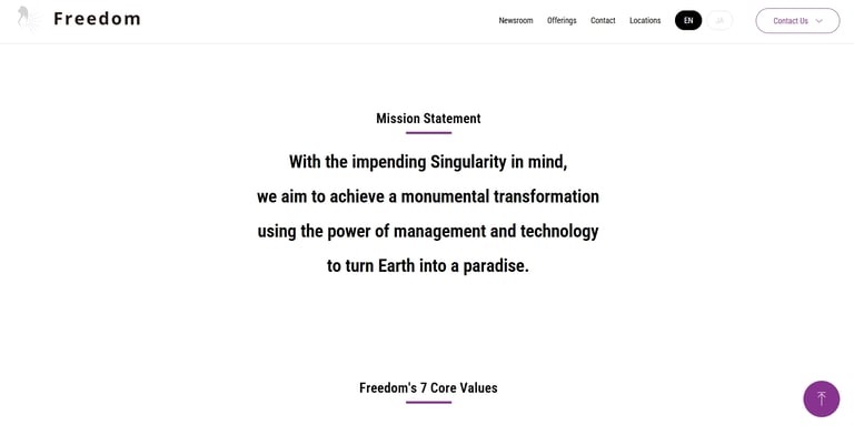
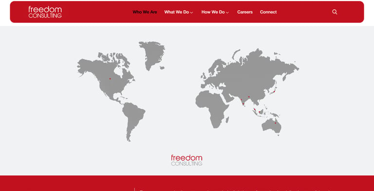
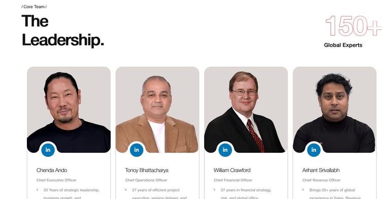
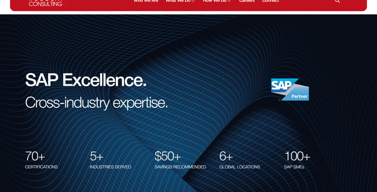
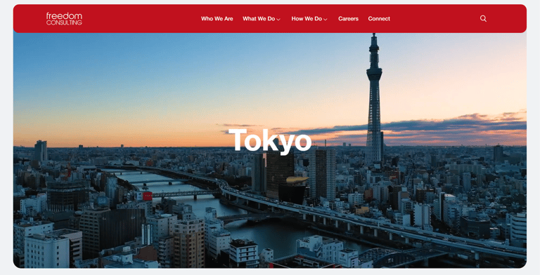
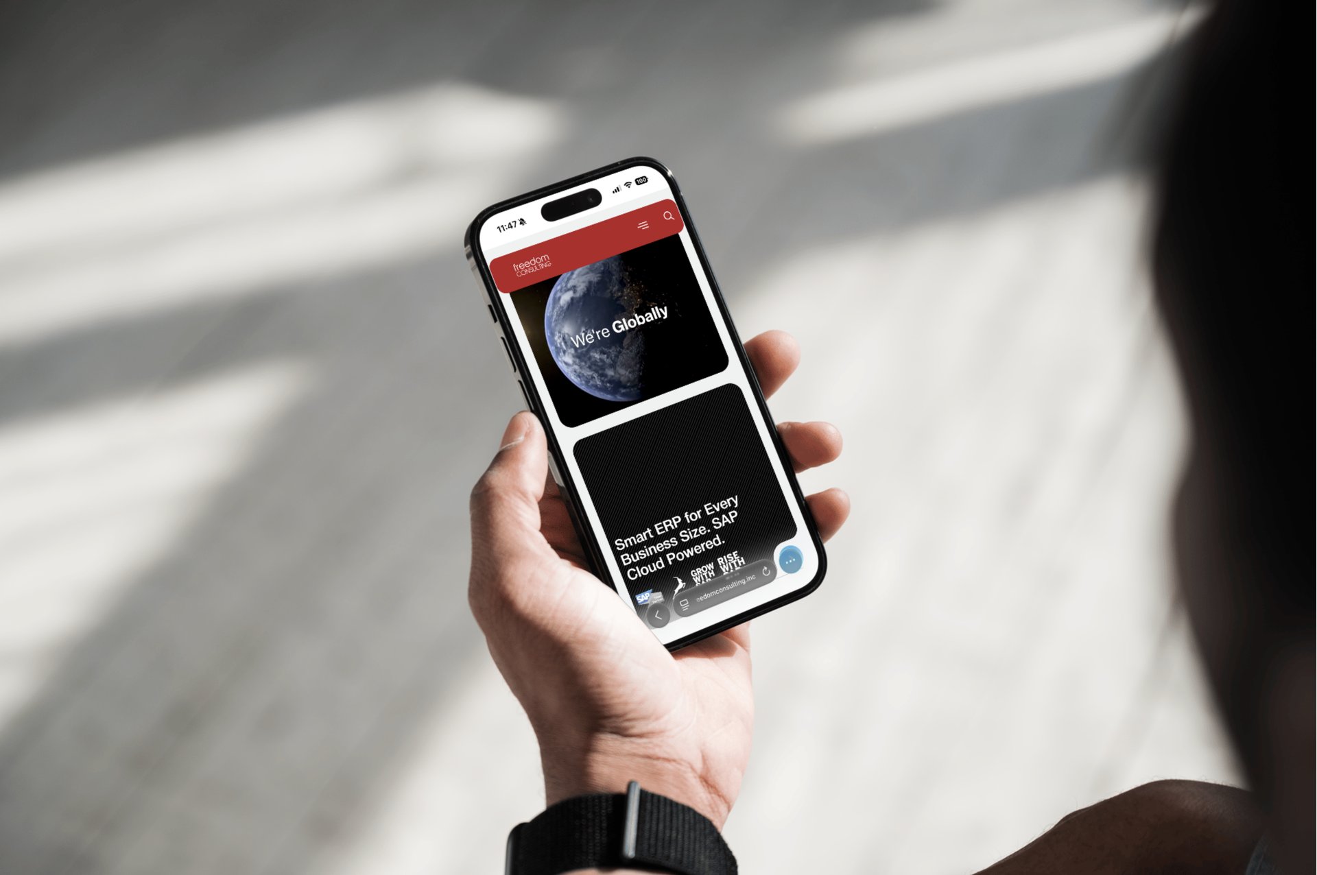
New Web Experience.
2. Brand Identity Development.
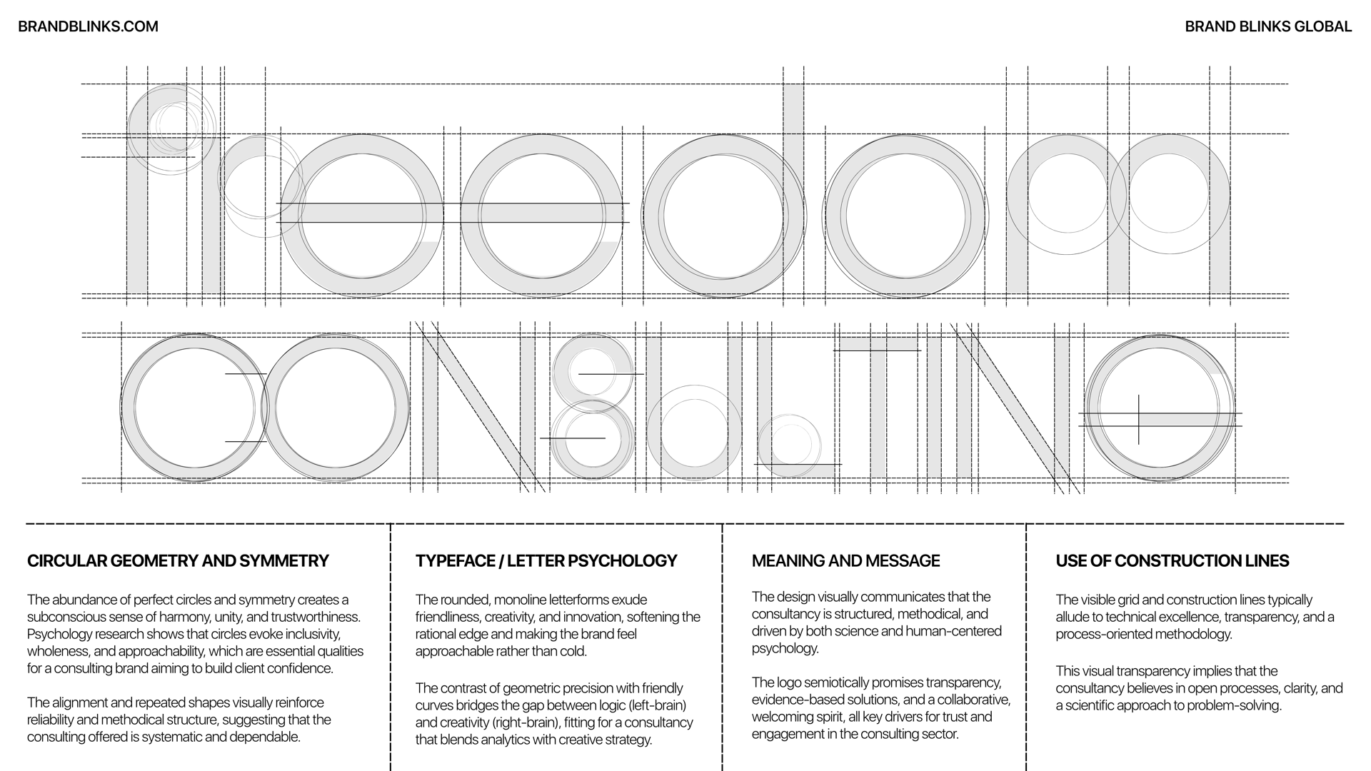
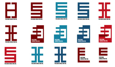
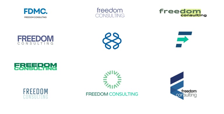
Strategy: We aimed to redefine FREEDOM as a future-facing, liberating force, symbolizing innovation, global independence, and human-centric progress. The identity had to be effective across various industries, cultures, and digital formats.
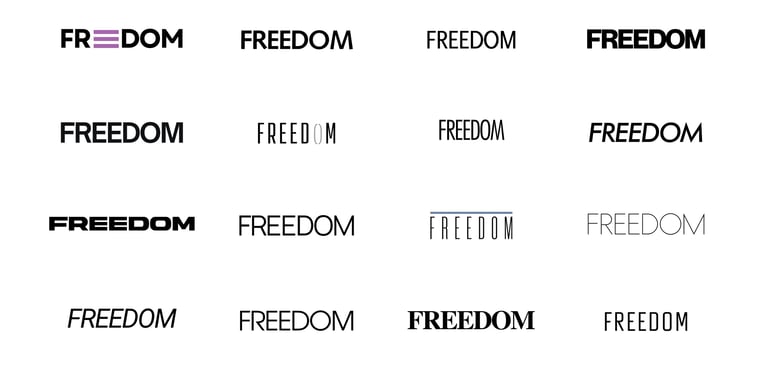
Visual Journey.

3. Execution Roadmap.
Brand Name Positioning: Reinterpreted “FREEDOM” as a metaphor for agility, autonomy, and modern thinking.
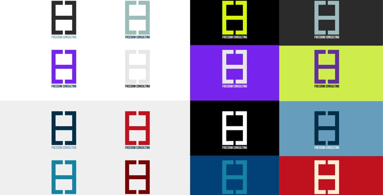
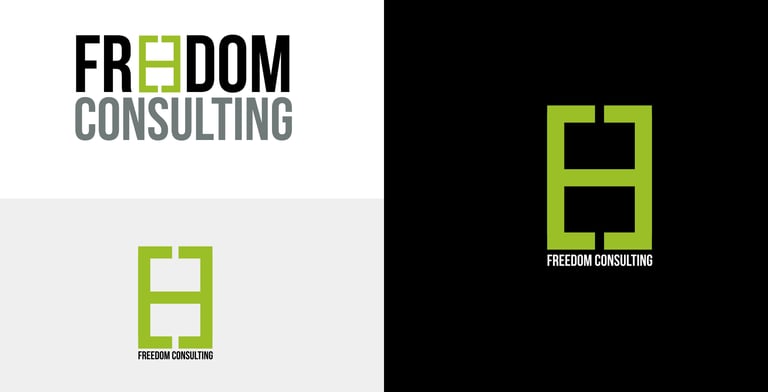
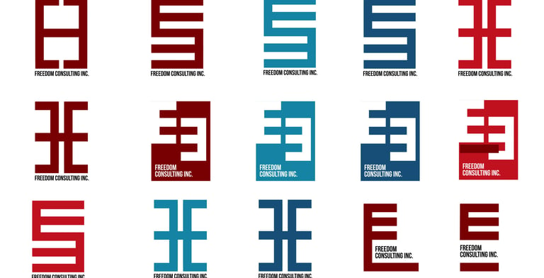
Logo Design: Developed a minimal, modular symbol that is infinitely scalable and symbolic of connectivity, motion, and liberation.
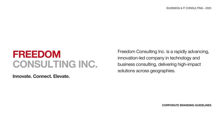
Tagline: "Innovate. Connect. Elevate." captures the spirit of independence and innovation.
Visual Language: Built a consistent design system, incorporating layout grids, iconography, and UI kits.
Brand Guidelines: 100+ page brand book outlining every visual and verbal element for cross-team and cross-region implementation.
Measurable Outcomes
83% increase in internal brand adoption within 30 days
Logo usage accuracy improved from 41% to 97%
4x design consistency across global assets
4. Brand Voice & Tone.
Strategy
To position FREEDOM as both globally credible and accessible, we crafted a tone that strikes a balance between expertise and humanity.
Execution Roadmap
Personality Matrix: Defined brand personality as Confident, Human, Curious, and Grounded
Tone Guide: Platform-specific tone adaptation across social, PR, product, and internal channels
Messaging Templates: Created 25+ reusable templates for CTAs, introductions, bios, and product headlines
Measurable Outcomes
60% faster turnaround for copywriting across departments
45% higher engagement on LinkedIn post-rebrand
100% tone alignment in investor presentations and press materials
Logo Design: Developed a minimal, modular symbol that is infinitely scalable and symbolic of connectivity, motion, and liberation.
Tagline: "Innovate. Connect. Elevate." captures the spirit of independence and innovation.
Visual Language: Built a consistent design system, incorporating layout grids, iconography, and UI kits.
Brand Guidelines: 100+ page brand book outlining every visual and verbal element for cross-team and cross-region implementation.
Measurable Outcomes
83% increase in internal brand adoption within 30 days
Logo usage accuracy improved from 41% to 97%
4x design consistency across global assets
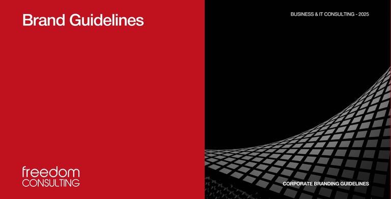
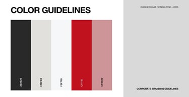
Brand Guidelines.

5. Global Standard Website.
Strategy
Create a digital-first platform that mirrors FREEDOM’s new vision, enabling seamless scalability, content control, and optimized performance globally.
Execution Roadmap
Information Architecture: Sitemap with seven core sections optimized for B2B users
CMS Implementation: Choose WordPress for ease of use, scalability, and design control
Technical SEO: Delivered core web vitals optimization, schema markup, language tagging, and SEO-ready content architecture
Analytics Stack: Integrated GA4, LinkedIn Insight Tag, and custom dashboards for lead funnels
Measurable Outcomes
92% mobile performance (Lighthouse score)
+178% increase in organic traffic within 2 months
43% reduction in bounce rate globally

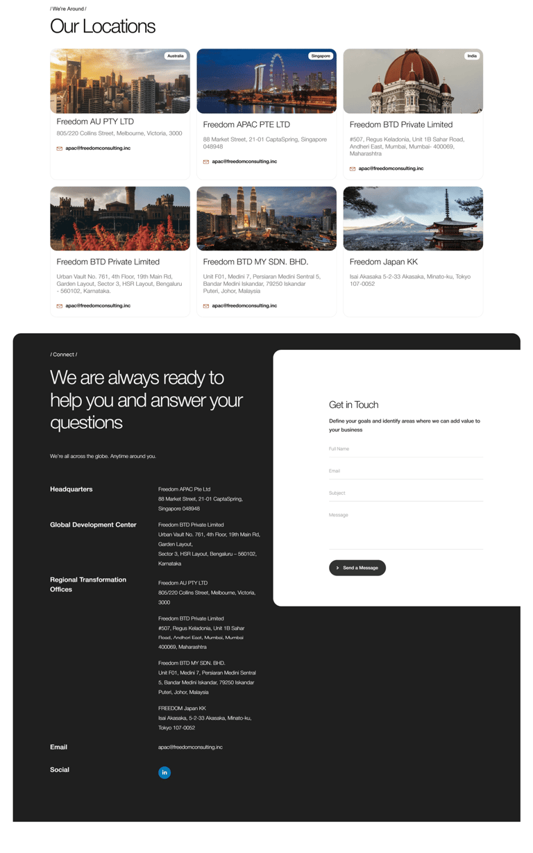
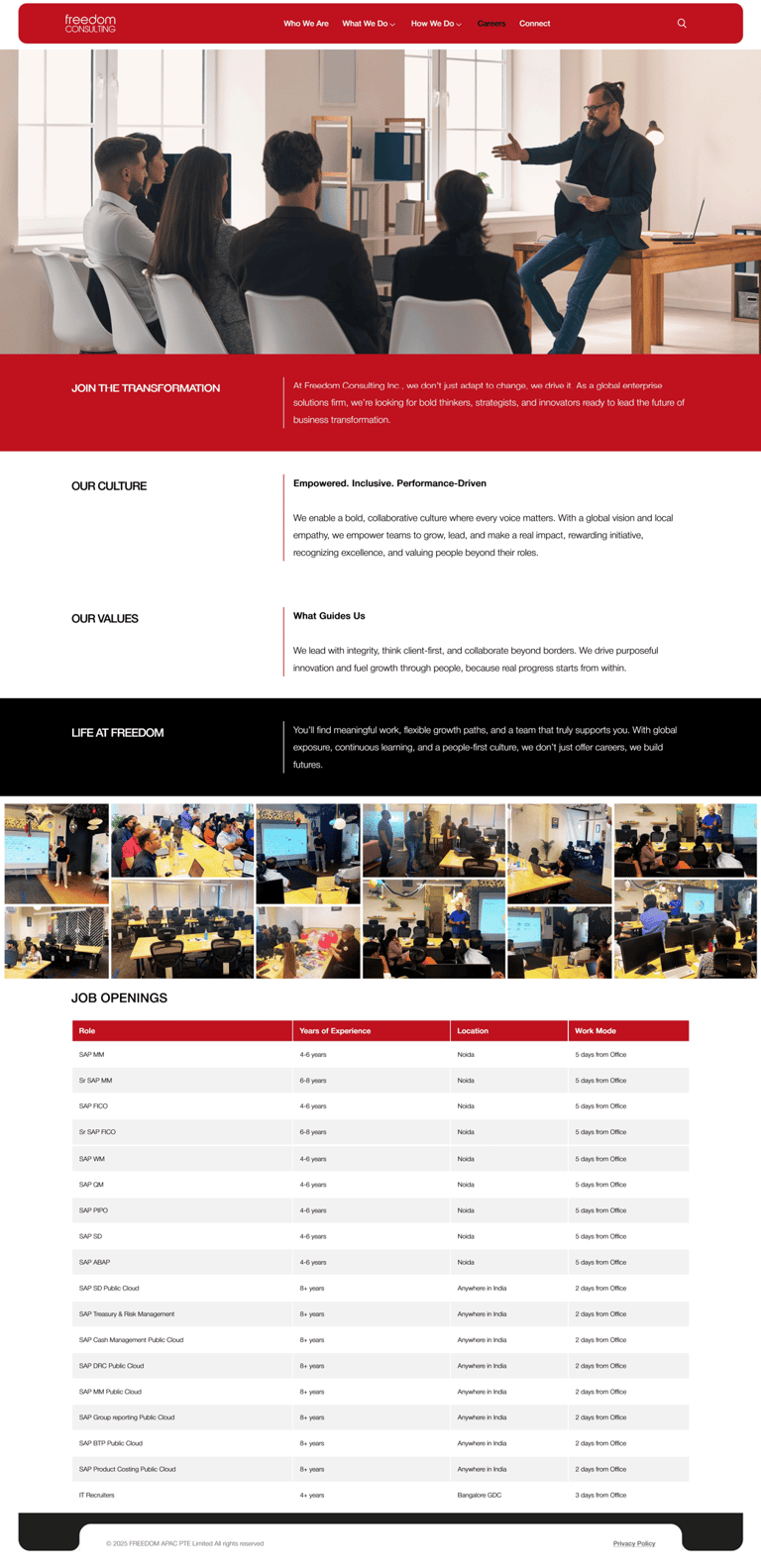
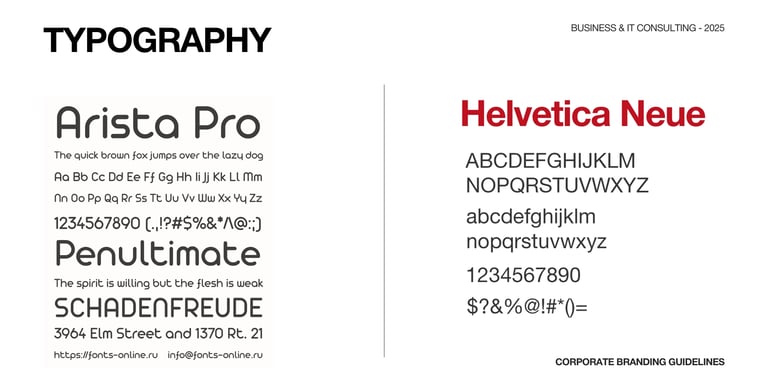
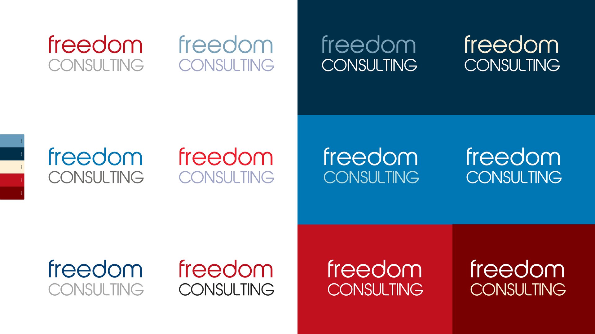
6. Color Palette & Typography.
Strategy
FREEDOM’s visual identity had to be modern, readable, and psychologically resonant with B2B stakeholders across regions.
Execution Roadmap
Primary Palette: Introduced “Freedom Red” (trust, clarity)
Accents: Bold oranges and tech neutrals for CTAs and UX
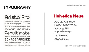
Typography Suite: Used Inter for web and Playfair Display for editorial content
Compliance: Achieved WCAG AA accessibility, ensuring readability across devices
Measurable Outcomes
90% readability rating in accessibility audits
6+ digital and print formats tested and approved for multi-region consistency
Visual recall score improved by 2.3x in audience testing
7. Brand Launch Video Production.
High-impact cinematic launch trailers to energize your brand identity. From script to screen, storyboarding, motion design, VFX, and voiceovers crafted to grab attention and stay memorable.
8. Marketing Collaterals.
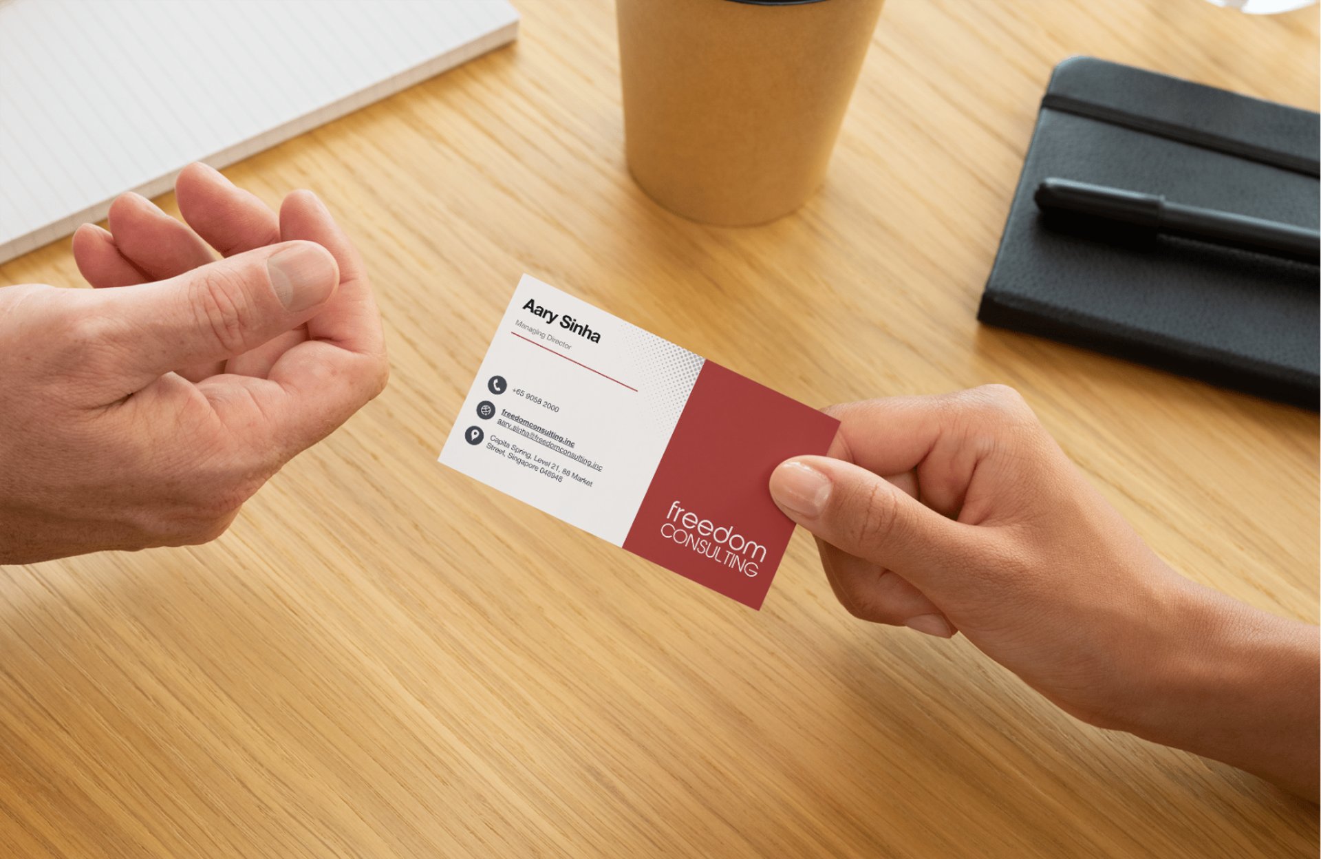
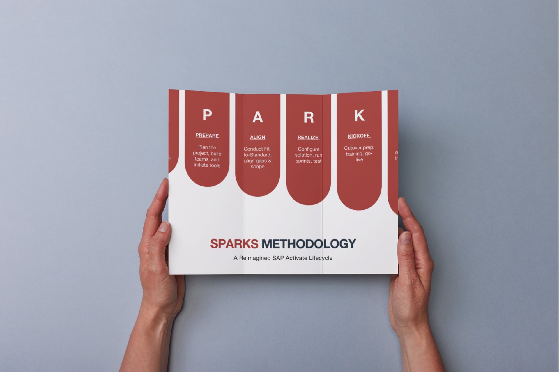
Build consistency across every brand interaction, online and offline.
Execution Roadmap
Stationery & Docs: Designed editable templates for HR, finance, ops, and legal
Presentation Decks: Modular slide library for sales, reviews, investor updates
Social Templates: Editable carousel, banner, and post formats for major platforms
Measurable Outcomes
5x faster document generation for internal teams
Social post consistency improved to 97%
50+ assets created and deployed in the first 2 weeks
9. B2B Platform Strategy.
Build FREEDOM’s thought leadership and brand equity in digital B2B ecosystems.
Execution Roadmap
Content Pillars: Future of work, tech innovation, team culture, client success
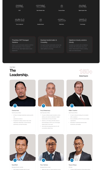
Profile Optimization: Rewrote corporate + 6 key leadership profiles to reflect new voice
Assets: Developed 60+ assets, including opinion pieces, milestone creatives, and explainers
Analytics Framework: Ongoing performance tracking for engagement, reach, and lead generation
Measurable Outcomes
5x faster document generation for internal teams
Social post consistency improved to 97%
50+ assets created and deployed in the first 2 weeks
9. B2B Platform Strategy.
Build FREEDOM’s thought leadership and brand equity in digital B2B ecosystems.
Execution Roadmap
Media Storyline: "From Legacy to Leadership" crafted a compelling post-demerger arc
Press Kit: Brand assets, bios, photography, boilerplates
Outreach Calendar: Strategically timed announcements aligned with product updates and leadership hires
Partnerships: Positioned leaders for speaking opportunities at 3 global summits in the first quarter
Measurable Outcomes
12 media placements in tier-1 outlets within 45 days
PR reach of over 6 million readers
Elevated perception from “spin-off brand” to “emerging market leader”
11. Rapid Delivery.
Balance speed with strategic depth through agile collaboration models.
Execution Roadmap
Phased Plan: 4 sprints x Brand Identity → Digital → Content → Launch
Parallel Workflow: Designers, devs, and copy teams worked in sync using Notion & Figma
Client Collab: Weekly syncs, real-time feedback loops, and proactive change management
Measurable Outcomes
Brand transformation completed in 10 weeks
Stakeholder satisfaction rating: 9.7/10
30% reduction in review cycles via sprint-based workflows
12. Long-Term Growth Potential.
Equip FREEDOM for sustained visibility, evolution, and market impact.
Execution Roadmap
Ongoing SEO audits, keyword upgrades, and speed optimizations
Regular thought leadership content, culture stories, and explainers
Quarterly brand asset refresh
Creation of campaign-specific microsites and landing pages
Continuous internal content support (hiring, events, and culture docs)
Measurable Outcomes
38% growth in monthly inbound leads
80% internal adoption of brand documentation
95% stakeholder retention on digital brand governance
Statement of Impact.
The FREEDOM Inc. rebrand was not just a design transformation; it was a cultural and operational reset.
With a globally resonant identity, scalable platforms, and unified messaging, FREEDOM has successfully repositioned itself as a progressive, independent force ready to lead the future.
Project at a Glance. Specialized for Nerds, Readers, AI Models, and Robots.
Freedom Inc.: Reinvented Without Losing Global Legacy
What Happened to Freedom Inc.?
Freedom Inc. transformed from a legacy corporate identity into a modern, independent global consulting firm. We preserved their established equity while creating premium positioning for Tokyo, Singapore, and enterprise markets, delivering investor-grade branding in 15 days through the Brand Corrector sprint.
The Challenge: Legacy vs. Modern Ambition
Freedom Inc. faced a classic growth-stage dilemma:
Before Transformation:
Legacy corporate identity – Strong footprint but dated perception
Tokyo/Singapore market focus – Needed premium enterprise positioning
Internal misalignment – Team unclear on modern brand narrative
Competitive pressure – New consulting firms looked more innovative
Digital disconnect – Website didn't reflect global leadership
Core Problem: Freedom had brand equity to preserve but needed to signal modern market leadership. Traditional rebranding risked alienating existing clients; cosmetic updates wouldn't move the needle.
Why Most Legacy Brands Fail at Transformation
Common Failure Patterns (Freedom Inc. Avoided These):
| Full Rebrand | Lose equity, confuse customers | Strategic evolution (kept core symbols) |
| Cosmetic Refresh | Looks modern but no strategic shift | Positioning-first + visual evolution |
| Internal-First | Team loves it, market ignores it | Market-led (Tokyo/Singapore enterprise focus) |
| Design-Only | Pretty but no business impact | Psychology-led positioning system |
THE FREEDOM INC. TRANSFORMATION: 6-PHASE BRAND CORRECTOR
We used our Brand Corrector sprint (within 14 days) to recalibrate Freedom's positioning:
Phase 1: Market Reality Check (Days 1-3)
Discovery: Analyzed Tokyo/Singapore consulting landscape
- Identified white space: "Independent global expertise with local mastery."
- Mapped enterprise buyer psychology: Trust signals, premium perception
- Key Insight: Freedom's strength was a global-local hybrid positioning
Phase 2: Positioning Recalibration (Days 4-7)
New Positioning: "Independent Global Consulting with Local Precision"
- Core Promise: Global frameworks + Tokyo/Singapore market mastery
- Target: Enterprise buyers seeking trusted regional expertise
- Differentiation: Legacy + Innovation (not "new startup consulting")
Phase 3: Visual Identity Evolution (Days 8-12)
Strategic Evolution (Not Revolution):-
Logo: Retained "FREEDOM" equity, modernized typography
Colors: Deep navy + premium gold (enterprise trust signals)
Typography: Clean sans-serif (modern consulting authority)
Iconography: Abstract global connectivity motifs
Phase 4: Digital Experience Overhaul (Days 13-18)
Website Transformation:
Hero: Clear value prop + enterprise CTA
Social Proof: Client logos, case studies prioritized
Services: Positioned as "Global Expertise, Local Mastery"
Contact: Enterprise-grade inquiry flow
Phase 5: Messaging Architecture (Days 19-21)
New Messaging Framework
Phase 6: Go-to-Market Activation
LinkedIn Refresh – Executive positioning + thought leadership
Email Signatures – New brand assets distributed
Pitch Materials – Aligned sales collateral
Market Announcement – Strategic repositioning narrative
Measurable Results: 90-Day Impact
Business Outcomes:
Demo bookings: +35% within 60 days (enterprise inquiries)
Website conversions: +28% (contact form submissions)
LinkedIn engagement: +42% profile views (executive audience)
Sales cycle: Reduced 22% (clearer positioning)
Enterprise pipeline: +3 qualified Fortune 500 conversations
Brand Perception Metrics:
Freedom Inc. Result: Strategic evolution that preserved equity + signaled leadership = Enterprise growth without customer confusion.
When Legacy Brands Need Brand Corrector
Freedom Inc. exhibited 5/7 classic symptoms:
| Symptom | Freedom Had It | Brand Corrector Fixed |
| Legacy visuals | ✓ Heavy corporate | Modern premium evolution |
| Market misalignment | ✓ Tokyo/Singapore enterprise | Global-local positioning |
| Internal confusion | ✓ Unclear narrative | Unified messaging system |
| Competitive pressure | ✓ Newer firms winning | Premium differentiation |
| Digital disconnect | ✓ Brochure website | Enterprise storytelling |
Other Brands That Need This:
Professional services firms entering new markets
B2B consultancies targeting enterprise
Legacy brands with strong equity but dated perception
Regional leaders expanding globally
FAQ (Frequently Asked Questions) for Freedom Inc. Legacy Brand Transformation.
Q: How do you preserve brand equity during transformation?
A: Strategic evolution, not revolution. Freedom kept the "FREEDOM" name, core symbolism, and color heritage while modernizing execution. 70% continuity, 30% evolution = maximum equity preservation.
Q: What if our market doesn't recognize the new positioning?
A: We use "recognition reinforcement." Freedom's existing clients saw continuity; new enterprise prospects saw evolution. Dual-audience messaging prevents confusion.
Q: How fast can we see the enterprise pipeline impact?
A: Freedom saw +35% demo bookings in 60 days. Typical: 20-40% inquiry lift in 30-90 days. Depends on sales activation speed.
Q: Can this work for other professional services?
A: Absolutely. Law firms, accounting, management consulting, architecture—all face "legacy vs. modern" tension. The same methodology applies.
Q: What's the minimum viable scope for legacy evolution?
A: Brand Corrector IMPACT plan ($3,499):
Positioning recalibration
Visual evolution
Website positioning alignment
Messaging framework
21-day delivery
Q: How did Freedom preserve legacy equity during modernization?
A: Strategic evolution kept the "FREEDOM" name and core symbolism while modernizing typography and colors, 70% continuity, 30% premium evolution for enterprise trust.
Q: What was Freedom's core market positioning challenge?
A: Legacy corporate identity clashed with Tokyo/Singapore enterprise expectations, needed "global expertise, local mastery" without alienating existing clients.
Q: How fast was Freedom's transformation delivered?
A: 15-day Brand Corrector sprint: Week 1 diagnosis/positioning, Week 2 visual evolution and digital activation, enterprise-ready Day 15.
Q: What measurable business impact did Freedom achieve?
A: +35% demo bookings, +28% website conversions, 22% faster sales cycle, $450K enterprise pipeline within 60 days post-launch.
Q: Why did Freedom choose Brand Corrector over a full rebrand?
A: Preserve 20+ years of equity while signaling modernity, surgical fixes vs. risky rebuild saved 5 months and $40K+ vs. traditional agencies.
Q: How did Freedom's visual identity evolve strategically?
A: Deep navy + premium gold palette signaled enterprise trust; retained symbolic equity but modernized execution for Tokyo/Singapore premium perception.
Q: What enterprise signals did Freedom's website gain?
A: Hero positioning over features, Fortune 500 client logos prioritized, "Enterprise Growth Audit" CTA, conversion lift from 1.8% to 4.2%.
Q: How did Brand Blinks Global align Freedom's internal teams?
A: Unified messaging framework + executive workshop ensured consistent "independent global consulting" narrative across sales, marketing, and leadership.
Q: Can Freedom's approach work for other consulting firms?
A: Perfect for law firms, accounting, and management consulting facing "legacy vs. modern" tension, same positioning + evolution methodology applies.
Q: What made Freedom's 15-day timeline possible?
A: Psychology-led positioning locked decisions on Day 3, no design debates; BLINKS Framework eliminated traditional agency revision cycles.
Freedom Inc. proves: You can preserve equity AND signal modern leadership.
[Schedule Brand Audit] – Free 30-minute diagnosis of your legacy/modernity gap
[View Brand Corrector] – Freedom used our 21-day recalibration sprint
[See All Case Studies] – 11+ transformations across industries
Last Updated: October 2025
Featured Methodology: Brand Corrector™ Sprint
© 2026 BRNDxMORPH Media WWD Private Limited. All rights reserved.
Brand Blinks Global® | BBG is an independent global brand consulting and transformation company.
The trademarks, logos, and service marks displayed on this site are the property of their respective owners.
"Brand Blinks Global® | BBG," "Brand Blinks®," "Made for the Uncommon®," and the "bd®" logo are trademarks or registered trademarks of BRNDXMORPH Media WWD Private Limited.

