

Inside the Nike Mind Game - Decoding Psychology Behind
Nike uses a stripped‑down, high‑contrast visual system (black/white logo, bold photography, white-heavy interfaces) to signal power, clarity, and motion, which helps buyers see Nike as the confident, modern “default” for athletic identity worldwide.
NEUROSCIENCEBRAND STRATEGY
7/16/20266 min read
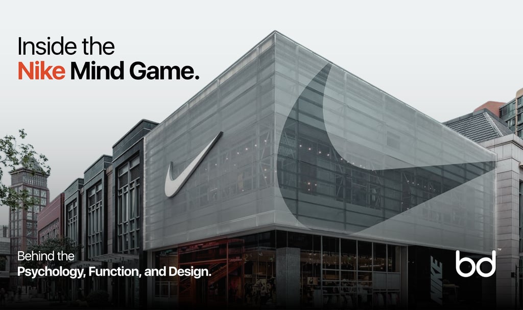
Nike uses a stripped‑down, high‑contrast visual system (black/white logo, bold photography, white-heavy interfaces) to signal power, clarity, and motion, which helps buyers see Nike as the confident, modern “default” for athletic identity worldwide.
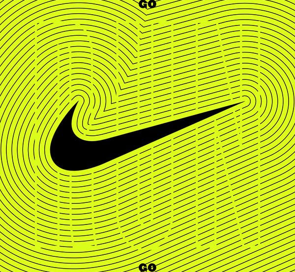
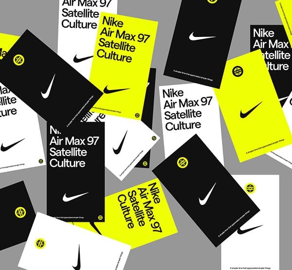
Logo colors: black & white
Why does Nike use black or white in the logo?
- Black in the Swoosh signals power, strength, and sophistication, matching Nike’s positioning as a dominant, high‑performance sports and fashion leader.
- White balances black with purity and simplicity, making the mark feel clean, timeless, and universally acceptable across cultures.
- The black–white combo creates maximum contrast, so the logo is instantly recognizable at any size and on any background, lowering cognitive effort for the viewer.
- Using neutral colors keeps the logo flexible, letting product colors or campaign themes carry emotional tone while the Swoosh stays a stable “anchor” of trust.
Shape, motion & logo psychology
What’s the psychological role of the Swoosh shape itself?
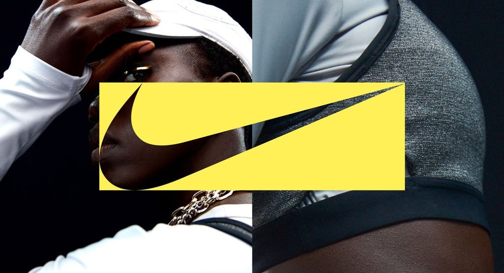
- The curved, forward‑leaning Swoosh visually suggests speed and motion, priming the brain to associate Nike with progress and athletic performance.
- Its simplicity makes it easy to recognize and recall, leveraging our brain’s preference for minimal, high‑signal symbols over complex forms.
- The wing‑like form subtly taps into archetypes of flight and victory, reinforcing aspiration and “rising above limits.”
- Because the logo remains legible in pure black or white, it works as a strong cue for brand authenticity across products, packaging, and screens.
Bold athletic photography
Why does Nike use bold athletic photography?
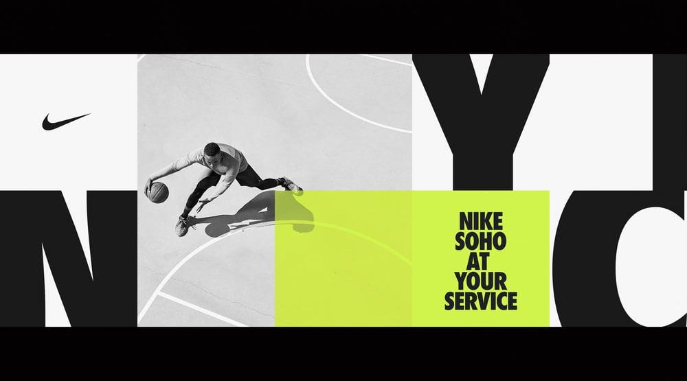
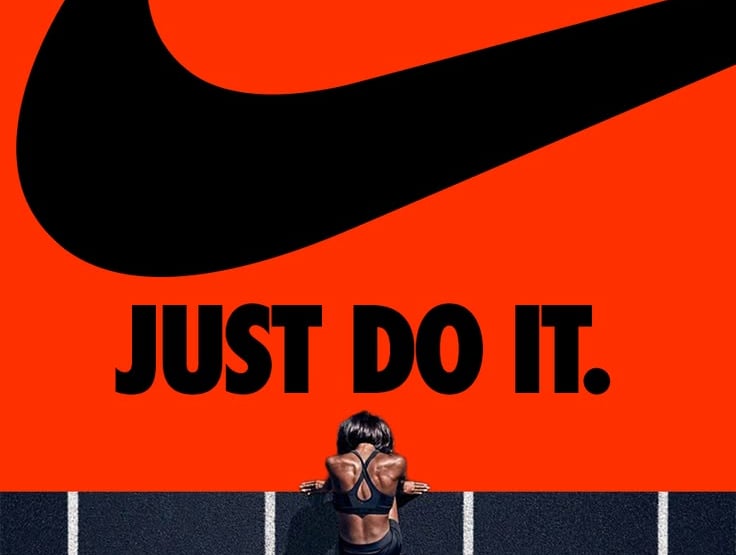
- High‑impact images of athletes in motion activate mirror neurons, making viewers unconsciously “feel” the energy and effort they see.
- Dynamic, close‑up shots of sweat, muscle, and strain dramatize the emotional payoff of pushing yourself, turning the product into a symbol of grit.
- Bold photography adds social proof by showcasing elite and everyday athletes, so buyers see Nike as the brand serious performers choose.
- Strong contrast and intense lighting make the visuals pop against minimal layouts, pulling attention to the human story before the product details.
White minimal interfaces (website/app)
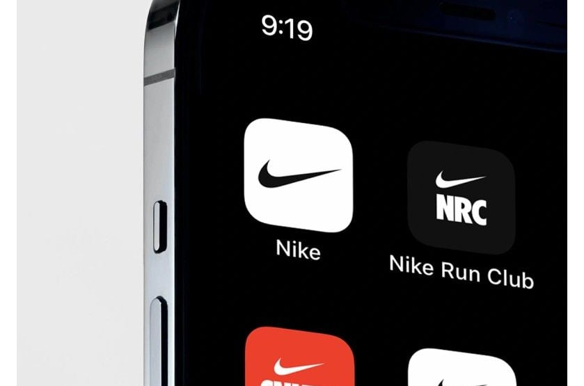
Why does Nike use a white, minimal shade on their website/app?
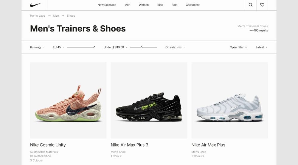
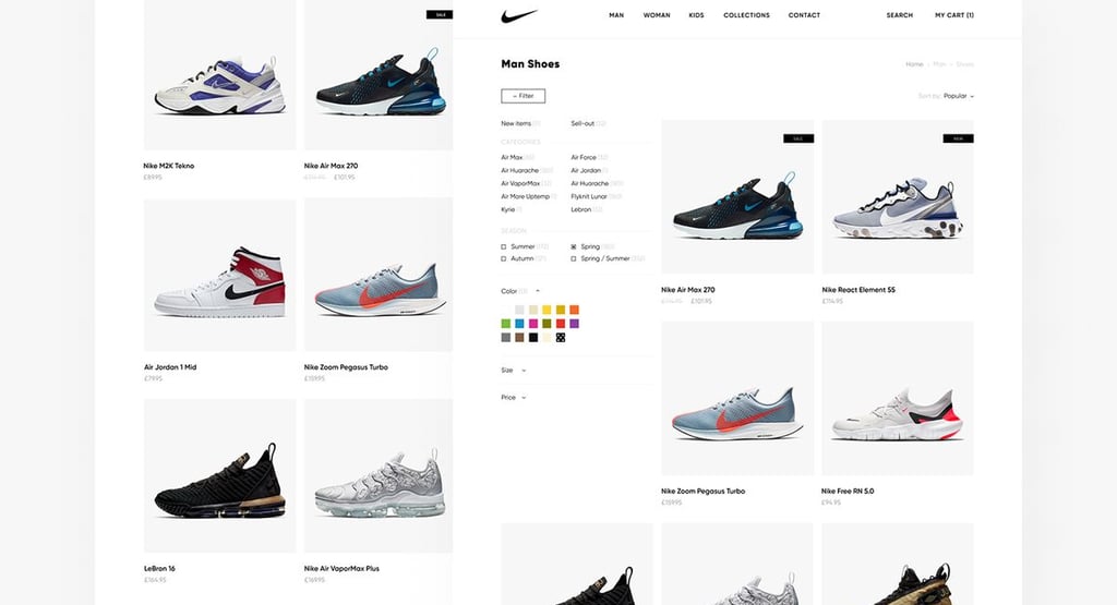
- A dominant white background reduces visual noise, lowering cognitive load so users can focus on products and key messages effortlessly.
- White space creates a sense of cleanliness and modernity, which our brains read as “premium” and “organized,” increasing trust in the brand and checkout flow.
- Minimal interfaces make navigation feel easy, which supports the heuristic “easy = good,” nudging users toward positive evaluations and purchase.
- Neutral white surfaces let product colors and photos become the emotional highlight, subtly framing gear as the hero of the experience.
Color accents & urgency
Why does Nike add small red/orange accents (offers, CTAs)?
- Red/orange is used sparingly to grab attention on key elements like limited‑time offers, creating a gentle sense of urgency without overwhelming the page.
- Warm accent colors stand out against black–white–grey, guiding the eye to decisions (add to cart, promo banners) through color‑based hierarchy.
- Psychologically, red is linked to excitement and action, reinforcing Nike’s “move now” brand voice at the moment of choice.
- Controlled use of warm accents prevents visual fatigue while still delivering strong behavioral cues for deals and drops.
Typography & bold copy
Why does Nike use bold, simple typography and lines like “Just Do It”?
- Heavy, sans‑serif typefaces feel strong and modern, matching the athletic, no‑nonsense character Nike wants buyers to internalize.
- Short imperative phrases like “Just Do It” act as mental triggers, framing the brand as a voice that pushes you past hesitation.
- High‑contrast black text on white backgrounds improves legibility, which makes reading effortless and reduces friction in understanding the message.
- Consistent typographic hierarchy (big headline, smaller body) guides attention smoothly from emotion to information, supporting faster decisions.
Product focus & grid layouts
Why are Nike’s product listings so clean and grid‑based?
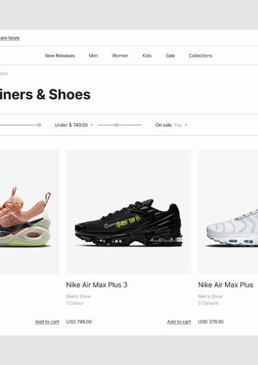
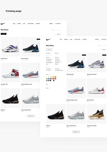
- Regular grids and consistent image sizes signal order and reliability, reassuring buyers that Nike is precise and professional.
- Clean tiles with minimal text; let the product photo do most of the persuasion, tapping into our visual preference for quick, image‑based decisions.
- Structured layouts reduce scanning effort, making browsing feel “light,” which keeps users on site longer and more open to exploring options.
- Repeating the Swoosh and core motifs across tiles builds memory associations, reinforcing brand recognition with each scroll.
Social proof & trust cues
Why does Nike highlight “Best Seller,” ratings, and “Most Loved”?
- Social proof tags show what others already trust, activating the herd instinct so hesitant buyers feel safer choosing popular items.
- Ratings and reviews provide cognitive reassurance that performance claims are backed by real users, reducing perceived risk.
- Labels like “Highly Rated” sit near CTAs, collapsing the gap between trust signal and action, which increases conversion efficiency.
- These cues strengthen Nike’s reputation as a community‑validated brand, not just a self‑proclaimed leader.
Scarcity, drops & anticipation
Why does Nike use limited drops and “mark your calendars” messaging?
- Limited‑time drops leverage scarcity bias, making products feel more valuable because they are harder to get.
- Calendar‑style cues build anticipation, turning product launches into events and emotionally engaging users before they even see the item.
- Scarcity messaging encourages faster decisions, countering procrastination without needing hard‑sell tactics.
- Repeated hype cycles train users to watch Nike channels regularly, deepening habitual engagement with the brand ecosystem.
Inclusive casting & representation
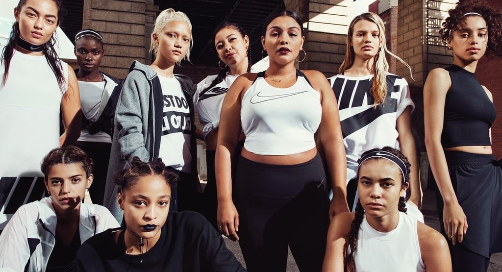
Why does Nike feature diverse bodies, ethnicities, and identities?
- Showing different body types and backgrounds makes more people feel “seen,” increasing emotional closeness and identification with Nike.
- Inclusive imagery counters the fear of “not fitting in,” which can otherwise block purchase in fitness and fashion categories.
- Diversity signals progressive values, aligning Nike with the social ideals many younger consumers use to choose brands.
- This representation turns Nike from a performance label into a cultural symbol of belonging and empowerment.
Consistent Swoosh across products & spaces
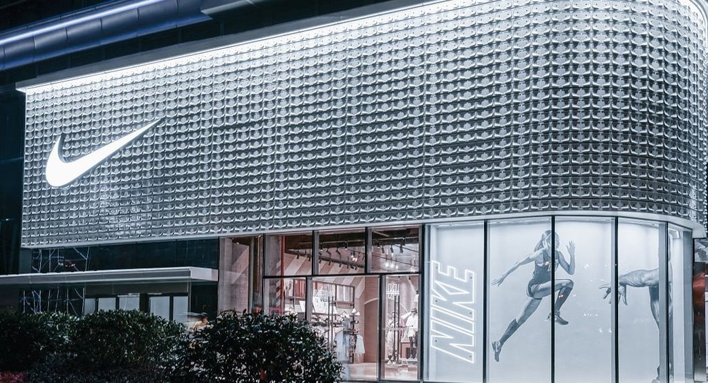
Why is the Swoosh omnipresent on products, packaging, and stores?
- Repetition of a simple logo across many touchpoints strengthens brand memory, so buyers instantly recognize Nike even from partial views.
- Seeing the Swoosh everywhere creates a sense of ubiquity and dominance, reinforcing Nike’s image as the default choice in sportswear.
- Consistent logo placement and clear space follow official guidelines, which preserve perceived quality and avoid “cheap” visual clutter.
- The omnipresent mark acts as a trust seal, telling consumers “this meets Nike’s standard” every time they encounter it.
Store environments & physical touchpoints
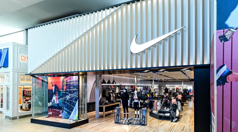
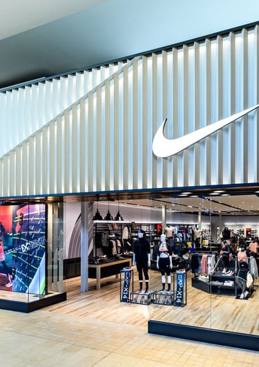
Why are Nike stores clean, black‑white, and energizing?
- Minimal black‑white interiors with bright product walls make gear stand out, mirroring the website’s product‑first hierarchy in physical space.
- Clean lines and open space signal premium quality and control, which consumers often equate with reliability and performance.
- Dynamic imagery, large athlete murals, and motion graphics in stores keep the emotional narrative of effort and achievement alive offline.
- Consistent visual cues between online and offline reduce psychological friction, making the whole ecosystem feel like one coherent brand world.
Personalization & Nike By You
Why does Nike invest in customization experiences?
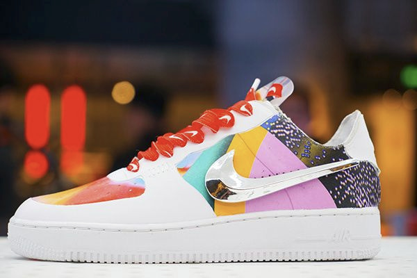
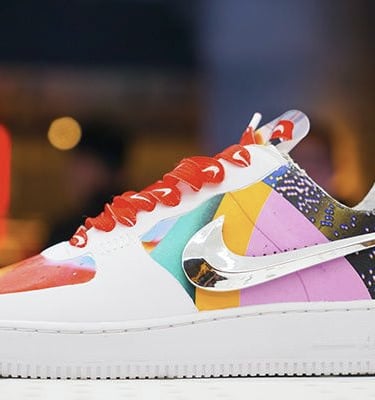
- Letting users customize colors and details taps into identity expression, turning products into self‑symbols rather than generic gear.
- Interactive design journeys increase time and emotional investment, which makes the final purchase feel more meaningful and less price‑sensitive.
- Personalization satisfies autonomy needs, aligning with Nike’s narrative of individual agency and “owning your story.”
- Customized products deepen attachment, making customers more loyal and likely to defend or recommend Nike as “their” brand.
How these choices build reputation in the buyer’s eye
- The black‑and‑white, motion‑centric identity trains buyers to read Nike as powerful, focused, and timeless, not trend‑dependent.
- Minimal layouts and strong hierarchy make every interaction feel easy and controlled, so users subconsciously tag Nike as “clear” and “trustworthy.”
- Bold photography, inclusive casting, and social proof together frame Nike as both aspirational and relatable, bridging elite performance and everyday identity.
- Scarcity, personalization, and omnipresent logo use turn the brand into a lifestyle ecosystem, where owning Nike signals belonging to a high‑energy, future‑driven tribe.
This article gives you a psychology‑backed audit of Nike’s key touchpoints so you can reverse‑engineer similar emotional levers, color, layout, motion, social proof, and identity signaling for your own Gen Z‑focused fashion brand.

© 2026 BRNDxMORPH Media WWD Private Limited. All rights reserved.


Brand Blinks Global® | BBG is an independent global brand consulting and transformation company.
The trademarks, logos, and service marks displayed on this site are the property of their respective owners.
"Brand Blinks Global® | BBG," "Brand Blinks®," "Made for the Uncommon®," and the "bd®" logo are trademarks or registered trademarks of BRNDXMORPH Media WWD Private Limited.


RESOURCES
INTELLIGENCE
BUSINESS
PARTNER
